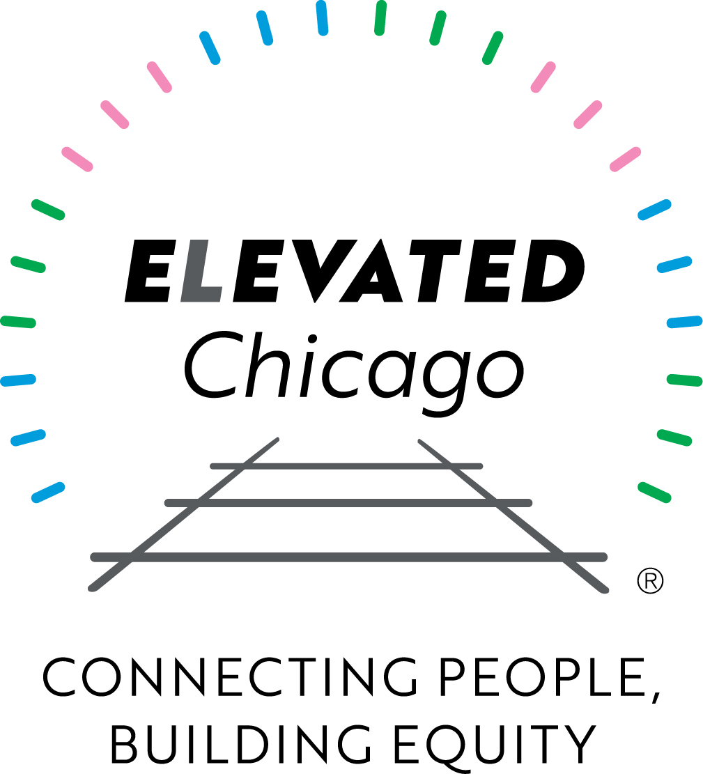
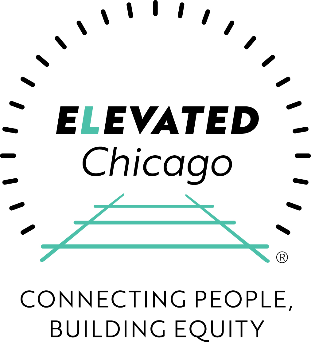
Elevated Chicago Logo
CLIENT: Rudd Resources LLC engaged Lange Creative Services as a team member on this project for their client, Elevated Chicago, a partnership of organizations in Chicago committed to equitable transit-oriented development.
CHALLENGE: In November 2017, with just over two weeks until a scheduled press conference to launch this new consortium of 17 organizations, Kimberley Rudd turned to Lange Creative Services to design Elevated Chicago’s logo. None of the logo designs presented in earlier weeks by the previously engaged design firm were hitting the mark.
SOLUTION: Within three days, Lange presented six logo treatments. One logo design was chosen almost immediately. Elevated Chicago began using the logo on a brochure also quickly designed by Lange as well as on promotional materials such as tote bags and pins for distribution at the launch event.
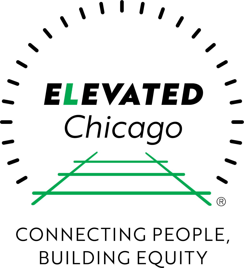
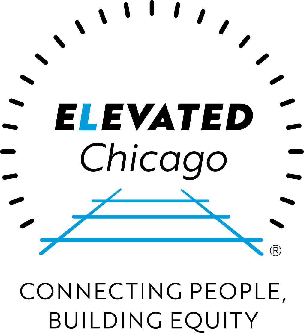
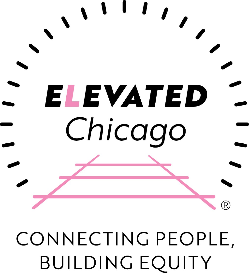
NOTE: Elevated Chicago focuses on seven eHubs, each defined by a 5-mile radius around a Chicago Transit Authority (CTA) elevated train station. Three CTA lines are involved: the “Green,” “Blue,” and “Pink” lines. In addition, some stations serve multiple lines and became designated by the color teal. The logo was adapted by color—green, blue, pink, teal—for use by organizations specifically focused on a particular eHub.